Showing posts with label 'Which box art is better?'. Show all posts

Saturday, August 29, 2015

Which Box Art is Best? (Hotel Dusk: Room 215)

After writing my recent #ADecadeofDS post about Hotel Dusk, I was forced to search the web for good-quality scans of its box art. (Sorry, I was too lazy to do it myself--although I'll surely do it before I publish my "Great Gaymathon" review of this Cing-developed adventure title in a week or two.)

In the process, I came across the cover illustrations produced for Hotel Dusk's Japanese and Korean counterparts. Both intrigued me so much that I decided I needed to work up another "Which Box Art is Better?" (or in this case, "Which Box Art is Best?") post devoted to them.

First up is the Japanese version's box art. In that region, the game was called Wish Room: Angel's Memory, which is just as appropriate as Hotel Dusk: Room 215, if you ask me.


Anyway, I find it interesting that this illustration completely ignores the ramshackle hotel that serves as the focal point (in different ways) of the North American and Korean covers.

The piece of box art below is well known to those of us who call Australia, Europe and North America home, of course.


Actually, the art that covers the frontside of my particular copy of Hotel Dusk is slightly different from what's showcased here--with a large orange banner sweeping across the top portion of the illustration and a "Touch Generations" logo appearing in its upper-left corner.

Finally, there's the Korean cover art, below, which takes the most straightforward approach and focuses on a hand-drawn depiction of the titular establishment. It also features headshots of Hotel Dusk's colorful cast of characters and even offers potential players a glimpse at how they'll hold their DS systems while working their way through this portable whodunit.


So, which one is my favorite? It's hard to say, although if I were forced to pick one over the others I'd probably go with the North American iteration, as I think it does the best job of emulating Hotel Dusk's contents.

That said, I'm also pretty fond of the Korean and Japanese cover illustrations. I like that the former actually shows the hotel and the game's book-like perspective, while I like that the latter takes a more creative approach to the same subject matter.

How about you? Which piece of Hotel Dusk (or Wish Room) box art do you like best?

See also: previous 'Which Box Art is Better?' posts

Wednesday, April 30, 2014

Pardon the re-introduction

Don't worry, I know the phrase is "pardon the interruption," but I decided to turn it on its head for this post because, well, in this post I'm going to be turning a few other things on their heads, too.

Specifically, I'm using this post to let folks know I'm renaming a few of the "columns" that are semi-regularly published here.

The column names in question--"Five Favorites," "Let's Play: Which Box Art is Better?" and "Shall We Do It?"--have been bugging me for a while now, so I decided a couple of weeks ago to try to come up with new ones.

Here are the possibilities I'm toying with at the moment:

The rather boringly titled "Five Favorites" will be dropped in favor of "The Fab Five." Or "Five Fabulous Favorites." Or maybe even "Five Fab Faves." I don't know.

On the other hand, "Let's Play: Which Box Art is Better?" will, without question, be replaced by the far more colorful (and silly) "Nice Package!"--with related headlines that will look something like this: "Nice Package! (Tomodachi Life, 3DS)."

Finally, "Shall We Do It?" is going to become "Let's Do It"--as in, "Let's Do It: Etrian Odyssey IV and Rusty's Real Deal Baseball (3DS)." I think.

By the way, I actually quite like "Shall We Do It?" as a column name. That question mark really messes things up, though, which is why I want to change it. That said, maybe there's a way I can tweak it to make it work--like, "Shall We Do It? (THE "DENPA" MEN 3 and Theatrhythm Final Fantasy: Curtain Call)."

As I'm sure you can tell, I'm not completely sure about any of the above--except, I mean, for "Nice Package!" That one's being used for sure.

What do you think? If you have any thoughts--especially about "The Fab Five" et al--please share them in the comments section below.

Oh, and as for the other columns I tend to publish here--the "Great Gaymathon" reviews, my "Somewhat Gay" reviews and "Manual Stimulation"--their names are staying put.

Monday, February 24, 2014

Let's Play: 'Which Box Art is Best?' (Osawari Tantei 1, 2 1/2 and 3 edition)

I'm not entirely sure why I'm as interested in the Touch Detective (Osawari Tantei in Japan) series as I am. After all, my copy of the first game, released for the DS back in 2006, is still sealed, and I've yet to even buy its 2007 sequel.

I guess it's all due to the adorable protagonist, Mackensie (Ozawa Rina in Japan) and her just-as-adorable mushroom companion, Funghi.

Regardless, the series has me by the balls at the moment, at least to an extent. Which is why I'm publishing a post about the box art that's been produced for the first three Osawari Tantei titles (the last of which was unveiled late last week).

Speaking of which, here is the first Osawari Tantei's cover imagery:


And here is the second game's:


As for the cover art produced for the third game (the title of which translates to Touch Detective Rising 3: Does Funghi Dream of Bananas?), here you go:


This third entry in the Osawari Tantei series hits Japanese store shelves on May 1, by the way. Hopefully we'll hear about a Western release in the next few months.

And if we do, I promise I'll not only unwrap my woefully ignored copy of the first Touch Detective, but pick up the second one, too--and play both of them before the 3DS sequel lands on our shores.

In the meantime, I probably should state which of the three box arts seen above I like the best. My first thought is to go with the first one, due in large part to its simplicity. That said, I like the latest one, too--its soft colors, especially.

How about all of you? Do you prefer one piece of Osawari Tantei cover art over the others?

Friday, October 04, 2013

Let's Play: 'Which Box Art is Better?' (Hometown Story edition)

When it comes to the systems that I already own and actually play (i.e., the 3DS), there are only a few games I'm looking to pick up between now and the end of the year.

One of them is Pokémon X. Another is Hometown Story, the adorable-looking life-simulation game made by Harvest Moon creator Yasuhiro Wada.

I've had the latter pre-ordered since Amazon first allowed me to do so a month or two ago, and I absolutely can't wait for it to arrive on my doorstep sometime between Oct. 22 (when it's due to be released in North America) and the end of the month.

In the meantime, I thought it might be nice to devote a "Which Box Art is Better?" post to this title--especially since the cover art for the Japanese version (releasing on Dec. 12) finally found its way onto the Internet yesterday.

Speaking of the Japanese version's box art, here it is:


And here is its North American counterpart:


Sadly, I've yet to come across the European iteration's cover art. Of course, the game doesn't have a solid release date in that region yet (just "Q1 2014"), so maybe that's why.

Anyway, which piece of box art do you like best?

Me, I like both of them--although if I were forced to say I preferred one over the other, I'd probably go with the Japanese option. I like that it's less cluttered than the North American one (which has far too many logos and call-outs) and I also like its central illustration is softer and more focused.

Buy: Hometown Story

Friday, August 09, 2013

Let's Play: 'Which Box Art is Better?' (The Legend of Zelda: The Wind Waker HD edition)

Because I'm a few days late to this particular parade (the one that's centered around the unveiling of The Legend of Zelda: The Wind Waker HD's box art, of course), I thought I'd give this post a bit of a boost by including the original GameCube cover illustrations as well.

Speaking of which, here's the colorful piece of cover art that greeted gamers when they wandered into Japanese stores searching for copies of Wind Waker back in 2002:


And here's the cover art that North American (and European ones, too, basically) gamers looked for when the cel-shaded title hit store shelves in their region three months later in early 2003:


Thankfully, Nintendo's designers decided to stay far away from the latter version's minimalism while creating Wind Waker HD's cover art.


In fact, I'd personally go so far as to say the Japanese--and European, in this case--box art (above) for this Wii U-based re-release is the best of the bunch.


I can't say the same for the North American version's cover imagery (also above), though, due to the over-the-top and out-of-place filter that makes it look like Tingle emptied his bladder on it.

As always, that's just my opinion on the matter. What's yours?

Note: the Japanese and North American Wind Waker HD covers were nabbed from tinycartridge.com.

Friday, June 21, 2013

Let's Play: 'Which Box Art is Better?' (Final Fantasy XIV: A Realm Reborn edition)

Late last week, I tweeted the following: "Assuming the PS3 gets a price drop later this year, I think I'm going to pick one up just so I can play Final Fantasy XIV: A Realm Reborn."

Although the main reason I want to buy A Realm Reborn (along with a PS3, of course) is its appealing looking gameplay, I'd be lying if I said its box art didn't have a little something to do with it, too.

The question is: which piece of Final Fantasy XIV box art am I talk about--the Japanese, North American or European one?

I'll answer that at the end of this post. In the meantime, let's take a gander at box arts in question.

For starters, here's the Japanese release's cover image:


And here's the illustration that's supposed to grace covers of the North American iteration:


As for the European version of Final Fantasy XIV, here's its cover art:


Last, but not least, there's the following, which will appear on the outer packaging of the Collector's Edition of the title that'll be sold in Europe and North America:


As for which one I like best, well, I can't help but go with the Collector's Edition. It has to be said, though, that I like the (rather busy) Japanese cover art nearly as much.

Which piece of Final Fantasy XIV: A Realm Reborn box art is your favorite? Assuming you like any of them, of course...

See also: previous 'Which Box Art is Better?' posts

Monday, May 20, 2013

Let's Play: 'Which Box Art is Better?' (New Super Luigi U edition)

After seeing the adorably (some might say overly) green box art for New Super Luigi U, I couldn't help but dedicate a "Which Box Art is Better?" post to it and its Mario-branded predecessor.

Before we get to our verdicts, though, I probably should point out that the digital version of New Super Luigi U will hit the Wii U eShop on June 20 (in North America) carrying a price tag of $19.99, while the boxed version will follow on Aug. 25 and cost $29.99.

Is the retail release's packaging worth an extra $10? I'm not sure I'd go that far, but I'd certainly go so far as to say I find it pretty darn appealing.


That said, how does it compare to the cover art produced for last year's New Super Mario Bros. U? Fairly well, I think.


Don't take that to mean that I unquestionably prefer New Super Luigi U's box art to New Super Mario Bros. U's. In fact, at the moment, I think I slightly prefer the latter to the former--mainly because it seems brighter and more colorful.

Do you prefer one to the other? If so, which one do you prefer?

See also: previous 'Which Box Art is Better?' posts

Wednesday, May 15, 2013

Let's Play: 'Which Box Art is Better?' (Pokémon X/Y edition)

I may not be the biggest Pokémon fan around, but I like the series well enough to follow developments related to its mainline releases.

Which is why, of course, I decided to devote a "Which Box Art is Better?" post to the covers that are being considered for Pokémon X and Y.

I'm guessing you don't need me to point out which is which, but just in case you do, here's Pokémon X supposedly preliminary box art:


And here's the art that'll likely grace the covers of Pokémon Y copies:


As for which I prefer: I'm a bit torn this time around, I have to say, as I really like X's cool tones and commanding protagonist while I think Y's has a better, more balanced, design.

If I were forced to pick one over the other, though, I'd probably go with Y. Which one would you choose and why?

See also: previous 'Which Box Art is Better?' posts

Friday, April 12, 2013

Let's Play: 'Which Box Art is Better?' (Umihara Kawase edition)

Now that Sayonara Umihara Kawase's box art has been unveiled (I came across it yesterday on NeoGAF), I thought it would be a good idea to dedicate a "Which Box Art is Better?" post to this vaunted series of platformers.

Before we get to the cover art that's been created for the newest Umihara Kawase title, which will be released this summer for the 3DS, let's check out the covers that came before it.

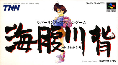
For starters, here's the illustration that was used on the original Super Famicom release (which hit the streets in Japan all the way back in 1994):


Three years later, Umihara Kawase Shun was released for the PlayStation, with the following piece of art gracing that version's packaging:


Strangely, Umihara Kawase Shun features between-stage commercials for a company called Mitchell. They were replaced (with pieces of illustrator Toshinobu Kondo's artwork) in a "Second Edition" of the game that saw the light of day in 2000. Here is that iteration's box art:


Fast forward eight years and you encounter Umihara Kawase Portable, a supposedly bug-riddled port of Umihara Kawase Shun:


That was followed a year later by Umihara Kawase Shun Kanzenban, a DS cart that contained both the Super Famicom and PlayStation titles as well as a handful of additional stages. Thankfully, it's reported to be bug-free.


Finally, we come to the recently announced Sayonara Umihara Kawase, a full-on sequel that's being developed by the same folks who made the series' initial offerings. Its cover art can be seen below.


Which piece of Umihara Kawase box art is my favorite? The one produced for the original pressing of Umihara Kawase Shun, no question. That said, I'm also pretty fond of the covers made for the Super Famicom and PSP releases.

I'm not much of a fan of Sayonara Umihara Kawase's cover art, sadly. It's by no means terrible, mind you, but it's also kind of boring--in my opinion, at least. Of course, all of the creations seen above are variations on a rather ho-hum theme, aren't they?

Now that I've had my say, what do all of you think? Do you prefer one example of Umihara Kawase box art over another?

See also: previous 'Which Box Art is Better?' posts

Thursday, March 07, 2013

Let's Play: 'Which Box Art is Better?' (Monster Hunter 3 Ultimate edition)

I know I'm a bit late to this particular party, but what can I say? I have little (or, rather, no) experience with the Monster Hunter series--although I'd like to change that sometime soon.

Will Monster Hunter 3 Ultimate, which will hit store shelves throughout North America and Europe on March 19 and 22, respectively, be the version that prompts me to join the MonHun party? Probably not, and that's mostly due to the fact that this release (once again) eschews online play.

I have to say, though, that if the folks had decided to re-use the Japanese box art (black bar and all), which can be seen below, while designing the North American iteration's packaging, I might have re-considered.


That's not to say I find the art (below) that will grace covers of North American copies--and European ones, too, if I'm not mistaken--of the game horrendous or anything like that. In fact, I think it's rather nice, all things considered.


Still, it lacks the drama of its Japanese counterpart--or at least it does in my opinion. I especially like the color scheme used on the Monster Hunter Tri G (that's what the game's called in its country of origin) cover art, what with its striking use of black, green and red.

Anyway, that's my take on the situation. What do all of you think? Do you prefer one of these box-art options to the other--and, if so, why do you feel that way?

See also: Previous 'Which Box Art is Better?' posts

Tuesday, February 26, 2013

Let's Play: 'Which Box Art is Better?' (Touch Detective 2 1/2 edition)

I don't know if any of you care to know this, but I've got the Beeworks-developed, Success-published Touch Detective titles on the brain at the moment--mainly because of my obsession with the series' soon-to-be-released (for 3DS) puzzler spin-off, Osawari Tantei Nameko Daihanshoku (aka Touch Detective: Funghi's Big Breed).

I'll have a brand-spanking-new copy of Osawari Tantei Nameko Daihanshoku in my grubby little (big) hands shortly, by the way, so keep an eye out for a post on it--if you're at all curious about it, of course.

In the meantime, I thought I'd publish another "Which Box Art is Better?" post dedicated to this charming (or so I've been told--I've yet to play one myself) series.

Last time, I focused on the first Touch Detective title, so today we're going to focus on the second, which is known as Touch Detective 2 1/2 in North America.

Speaking of which, here's the illustration that appeared on Japanese copies of the game:


And here is the art that graced covers of the North American version:


European copies of the game featured the same illustration, although it was rather garishly (and horrifically, if you ask me) colored:


Which one do I like best? Well, I'm sure you've already surmised that I'm not a fan of the Euro box art. With that out of contention, I guess I'll have to choose between the Japanese and North American covers.

Although I quite like the Japanese version's soft, almost pastel, paint job, I have to go with the North American option this time around as I feel it's far more illustrative of the game's content. Also, I really like how the designer(s) at Atlus decided to put the main character's hand to good use in the logo.

That's just my opinion on the matter, though; what's yours?

See also: Previous 'Which Box Art is Better?' posts

Friday, February 15, 2013

Let's Play: 'Which Box Art is Better?' (Touch Detective edition)

I've got the BeeWorks-developed, Success-published (in Japan) Touch Detective series on the brain at the moment thanks in large part to my recently professed obsession with the soon-to-be-released (and soon-to-be-in-my-grubby-hands) 3DS-based spin-off, Osawari Tantei Nameko Daihanshoku.

As such, I thought it would be fun to write up another "Which Box Art is Better?" post that focuses on these portable point-and-click adventures.

To get things off to a proper start, here's the art that graced Japanese covers of the first Touch Detective game (known over there as Osawari Tantei: Ozawa Rina):


And here's the illustration that appeared on copies of the North American release:


The European version's box art isn't too different from its North American counterpart, but I'm sharing it here anyway due to the fact that it's more colorful.


Finally, the more-precious-than-it-has-any-right-to-be box art seen below was used for the Japanese budget re-release of the game:


Which one is my favorite? Well, right off the bat I can tell you the Euro art is my least favorite (mostly because I find it a bit garish).

Strangely, I think the budget re-release cover would top my list (if one were to exist), even with its yellow border and excessive use of text. That said, I like the original Japanese and North American versions quite a bit, too.

Which one do you gals and guys prefer (assuming it could be said that you prefer one at all)?

See also: Previous 'Which Box Art is Better?' posts

Thursday, November 01, 2012

Let's Play: 'Which Box Art is Better?' (Style Savvy edition)

Did you get your fill of Style Savvy cover art last week when I devoted a "Which Box Art is Better Post?" to the just-released Style Savvy: Trendsetters and its international counterparts?

I hope not, as you're going to get a bit more of it today.

This time around, though, we're going to check out the box art that was created for the original Style Savvy.

Here's the "art" (yes, I'm using the word loosely in this case) that appeared on covers of the North American version of the game, which hit store shelves in late 2009:


Sadly, the art made for the game's European packaging, below, isn't much better. In fact, I think it could easily be said that it's worse than the North American version's box art.


So, how does the box art of the Japanese original, Wagamama Fashion Girls Mode, stack up? Pretty well, if you ask me.


Sure, it features far too much text, but at least that text is nicely stylized and colored.

As such, I'm personally giving Wagamama Fashion Girls Mode's box art the nod this time around. That's just my opinion, though; which cover do you like best?

See also: Previous 'Which Box Art is Better?' posts

Thursday, October 25, 2012

Let's Play: 'Which Box Art is Better?' (Style Savvy: Trendsetters edition)

Earlier this week, Nintendo of America released for the 3DS the long-awaited (by yours truly, at least) sequel to its fashion-focused DS game, Style Savvy.

In honor of that release, I decided to devote an entire "Which Box Art is Better?" post to it and its international counterparts.

Japanese gamers got their hands on the title first (on Sept. 27), so let's start with it. It's known as Wagamama Fashion Girls Mode Yokubari Sengen in its home market, by the way, and it sports a pleasantly colorful piece of cover art.


The box art created for the North American version, which is called Style Savvy: Trendsetters, on the other hand is decidedly less captivating.


Not that the art that's set to grace covers of the European iteration--which will be branded New Style Boutique and which will hit store shelves on Nov. 16--is any more interesting:


Those of you who have been paying attention likely have figured out that the Japanese box art is by far my favorite. Do you agree, or do you prefer the art that was created for its European or North American  counterparts?

See also: Previous 'Which Box Art is Better?' posts

Friday, October 12, 2012

Let's Play: 'Which Box Art is Better?' (Paper Mario: Sticker Star edition)

Although there are a number of 3DS games I'm looking forward to getting my grubby hands on next year--the next Animal Crossing, Etrian Odyssey IV and Fire Emblem: Awakening, among them--I'm eagerly awaiting quite a few 2012 releases, too.

Sitting atop the latter list: The latest (and hopefully greatest) chapter in Nintendo's Paper Mario saga.

As many of you likely already know, this 3DS title will be known as Paper Mario: Sticker Star when it's released throughout North America on Nov. 11. Here is the art that will grace the covers of said release:


The game will sport a slightly different name--Paper Mario: Super Seal--when it hits the streets in Japan on Dec. 6, and naturally it'll sport a different piece of box art, too.


Although I'd love to show you the cover art that'll be used on the Euro version of this Intelligent Systems-developed game, which also will be called Paper Mario: Sticker Star and will arrive on store shelves on Dec. 7, Nintendo of Europe has yet to reveal it.

Given that, I guess we'll just have to judge the pair of illustrations showcased above.

Personally, I much prefer the North American cover art to its Japanese counterpart this time around. Granted, the latter option does a much better job of depicting the game's sticker-collecting aspect, but that isn't enough to trump the former's bold use of color.

Now that I've had my say, what do all of you think of the box art that's been prepared for this portable RPG?

See also: Previous 'Which Box Art is Better?' posts

Friday, October 05, 2012

Let's Play: 'Which Box Art is Better?' (Professor Layton and the Miracle Mask edition)

Seeing as how Level-5's first 3DS-based Professor Layton title is due to hit the streets throughout both Europe and North America in a few short weeks, I thought I should prepare and publish another "Which Box Art is Better?" post in its honor.

Before we get to its European and North American cover art, though, let's take a look at the art, below, that can be found on Japanese copies of the game (which was released all the way back in February 2011).


The box art produced for the European version of Professor Layton and the Miracle Mask, which will find its way onto store shelves on Oct. 26 (the North American version follows just two days later), eschews its predecessor's minimalism in favor of a busy style that calls to mind the series' DS-based efforts. (View them here, here and here.)


At first glance, the title's North American cover art, below, looks pretty similar to that of its European counterpart, at least in terms of color and theme, but on closer inspection it manages to set itself apart thanks to a more elegant and less constricted design.


As for which one I like best: I'm sure this will shock some of you more excitable folks, but this time around I'm going with the European box art. Yes, it's busier than a mosquito at a nudist colony, and I'd like it a lot more if it included even 50 percent less text, but I still prefer it to its two "competitors."

For me, both the Japanese and North American cover designs are just a bit too ... sterile. (OK, so the Japanese design is way too sterile.) I consider the European design, on the other hand, to be dramatic and moody, plus it features the most appealing logo of the bunch.

That's just my opinion of this box-art trio, though; what's yours?

See also: Previous 'Which Box Art is Better?' posts

Friday, August 31, 2012

Let's Play: 'Which Box Art is Better?' (LittleBigPlanet Vita edition)

I'll be honest here: I'm not actually all that interested in this title. Like most folks, I used to drool over every screenshot and video I came across of this platformer's console-based predecessors. After reading a bunch of ho-hum impressions of the first LittleBigPlanet, though, the series basically fell off my radar.

Still, I'm always a sucker for good--or at least interesting--box art, which is where this particular blog post comes in. While perusing NeoGAF a week or so ago, I came across LittleBigPlanet Vita's Japanese box art and thought, "Hmmm, I like the looks of that!" A few clicks of the keyboard later, I found myself staring at--and, yes, liking--this portable platformer's European and North American covers, too.

The question is: Which LittleBigPlanet Vita cover illustration do I like best? Before I respond, let's take a little look-see at each of the contenders, shall we?

Actually, the following illustration can't actually be called a contender, as it won't appear on this game's packaging in any region, as far as I'm aware. Because a number of European and North American retailers used it as a placeholder image on their websites, though, I decided to include it here. (By the way, the game is set to hit Australia and Europe on Sept. 19, Japan on Sept. 20 and North America on Sept. 25.) 


The box art that eventually took its place on the aforementioned sites can be seen below.


As is typically the case, LittleBigPlanet Vita's Japanese cover art is quite different from that of its western counterparts:


As for which piece of box art I prefer: If the Japanese cover's background were light blue like the background of the European/North American cover, I'd go with it in a heartbeat, as I prefer the more colorful and whimsical nature of that creation. As it stands, though, I'm going to say it's a tie between the two.

What do all of you think? Do you have a favorite when it comes to LittleBigPlanet Vita's cover imagery?

See also: Previous 'Which Box Art is Better?' posts