That fondness begins, of course, with said instruction manual’s cover image (below, right), which shows Barunba‘s grinning protagonist gunning his way through a plethora of what appear to be crimson-tinged baddies.

I have to admit, I originally thought the protagonist was piloting his bubble-shaped ship through the innards of another human being, a la Psygnosis’ Microcosm. (I didn’t realize the red blobs in the background were the exteriors of a couple of creatures rather than their interiors, obviously.)
Anyway, the manual’s first two pages can be seen below. I’m guessing they detail the main character’s colorful back story, or something like that.

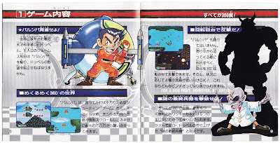
The next pages, on the other hand, seem to describe the many components of the game’s globe-shaped ship.

Barunba‘s main madman is exposed in the next set of pages. Who’s that brute behind him? It’s unlikely I’ll ever find out, as I find the game as boring as unadorned oatmeal.

Speaking of boring, you may as well skip the manual’s next few pages. Thankfully, they’re the only yawn-inducing ones.


You know, if Barunba‘s in-game sprites even partially resembled the illustrations shared on the following pages it likely would be a far more interesting experience. But would it be a more enjoyable one? Probably not.

Alas, these are the manual’s last few pages. They wrap things up on a high note, though, thanks in large part to that image on the right, which shows the game’s protagonist (what is his name, anyway?) battling a boss who looks as though he could be related to Metroid‘s Ridley.

So, there you have it: Ample evidence that just because a game sucks its instruction manual doesn’t have to follow suit.
See also: 'Mad Panic Coaster's awesome manual'


13 comments:
Wow, it's awesome that you're doing this. :)
Thanks, Darwin! Glad you're liking it so far. Really, these kinds of things need to be pointed out, don't you think?
Oh, and by the way: Click on the scans to see larger, clearer versions of them!
Ahh, I love this concept of posts about game manuals <3 Those cute little illustrations coupled with the fact that you actually had to read manuals back then... they truly don't make 'em like that anymore!
... too bad the game's not so hot, eh? Oh well, as is sometimes the case, "the book was better" ;)
Ha ha! Yes, in this case the book definitely is/was better, Kamiwoo. It's too bad, really -- Barunba means well, and does some interesting things, but overall it's too boring for its own good. I'll write an actual review of it soon to expand on why that is.
Anyway, thanks for the comment and I'm glad to hear you like this idea. Before I published these first two posts today, I was worried the series would only interest me :)
This is a great idea! Looking forward to seeing more manuals :D
Thanks, Kimimi! I'll try to post new entries in this series at least as much as I post entries in my other series (Great Gaymathon, Which Box Art is Better?). Anyway, glad you liked this one!
I have just been stimulated by these scans sir. Well done ^_^
Ha ha! Thanks, Famicom Freak :)
Wow, that's awesome! I confess that I haven't heard of this game but I agree - the cover and manual are fantastic! I initially thought he was inside the body of something on the cover too! :) Japanese artwork really is superb...
Afte this first installment, I'm wholeheartedly endorsing this pursuit.
Simon: Someday you should give the game a try. I have to admit that IMO its "gimmick" (rotating guns/weapons) is interesting, but can't save the game from being boring and kind of ugly -- which is a shame given the great care that was put into creating its cover and manual art.
Thanks, Justin! I don't know why I didn't think of this earlier. Anyway, I'm glad you liked the first installment. More will follow suit soon!
Post a Comment